
Contents
EMS allows the User to access a Pie Chart displaying the percentages of Sensor readings within a Zone that fall within or outside pre-defined ranges of values.
•Defining Pie Chart Parameters
1.Select Pie Chart View from the View Data menu on the top menu bar to expand a list of available Zones. See Figure 1084 below:
Figure 1084
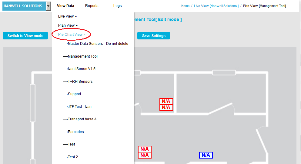
2.Click on the required Zone in the expanded list.
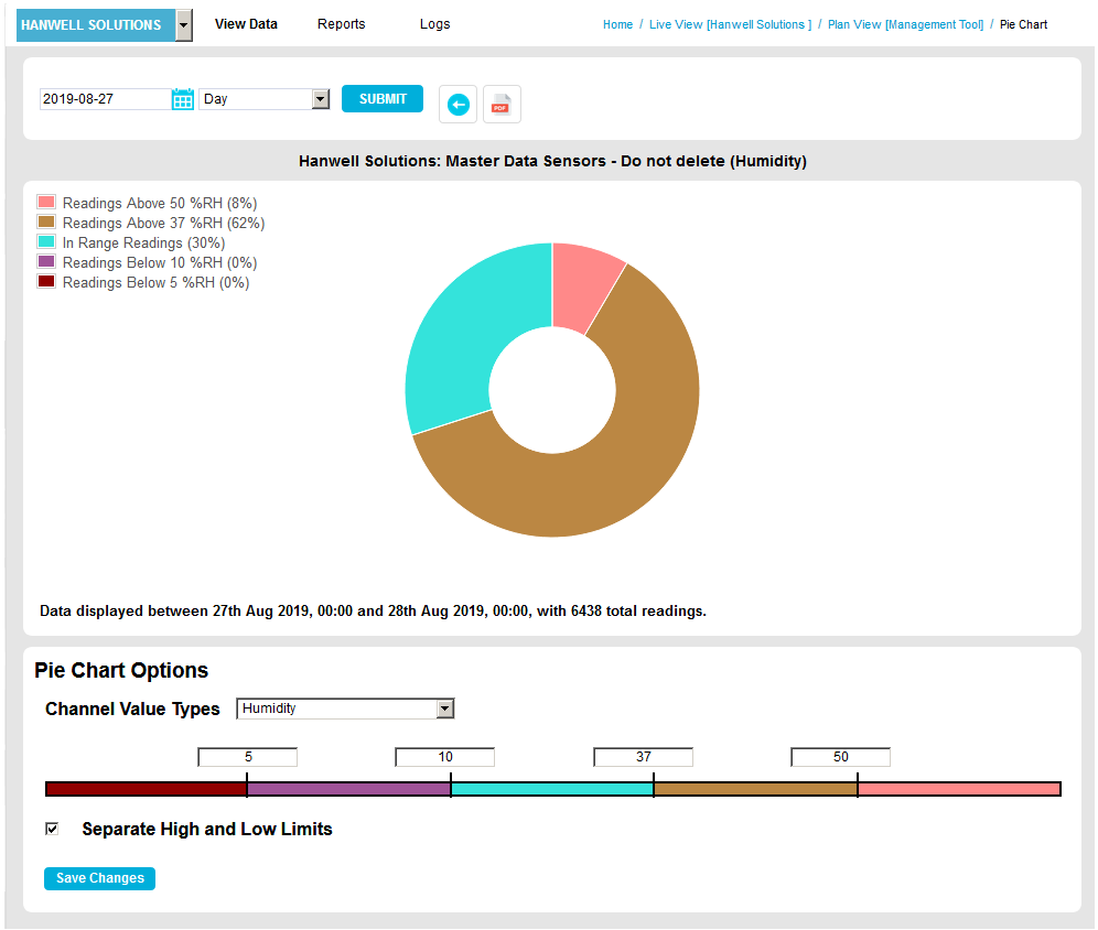
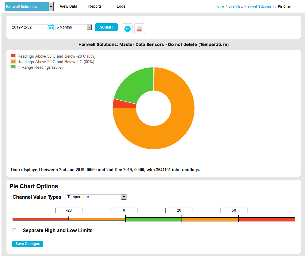
•A Pie Chart is displayed showing the percentages of Sensor readings, associated with the selected Zone, that are within or outside pre-defined ranges of values. See Figure 1085 below:
Figure 1085
•Passing the mouse pointer over each segment will display a pop-up dialog box stating the percentage of Sensors in the zone represented by the segment and the range of values it represents. See Figure 1086 below:
Figure 1086

Figure 1087
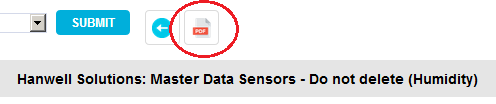
Clicking on the Save as PDF button (see Figure 1087 above) saves the Pie Chart as a PDF and displays the following window. See Figure 1088 below:
Figure 1088
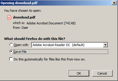
This message bar has the following buttons:
•Open
Selecting Open and clicking OK displays the chart as PDF in a new window.
•Save File
Selecting Save File and clicking Save saves the generated PDF file to the PC/Server's default Download location.
You can define the Pie Chart's representation of the Zone's Sensor readings by editing the Pie Chart window's fields as follows. See Figure 1089 below:
Figure 1089
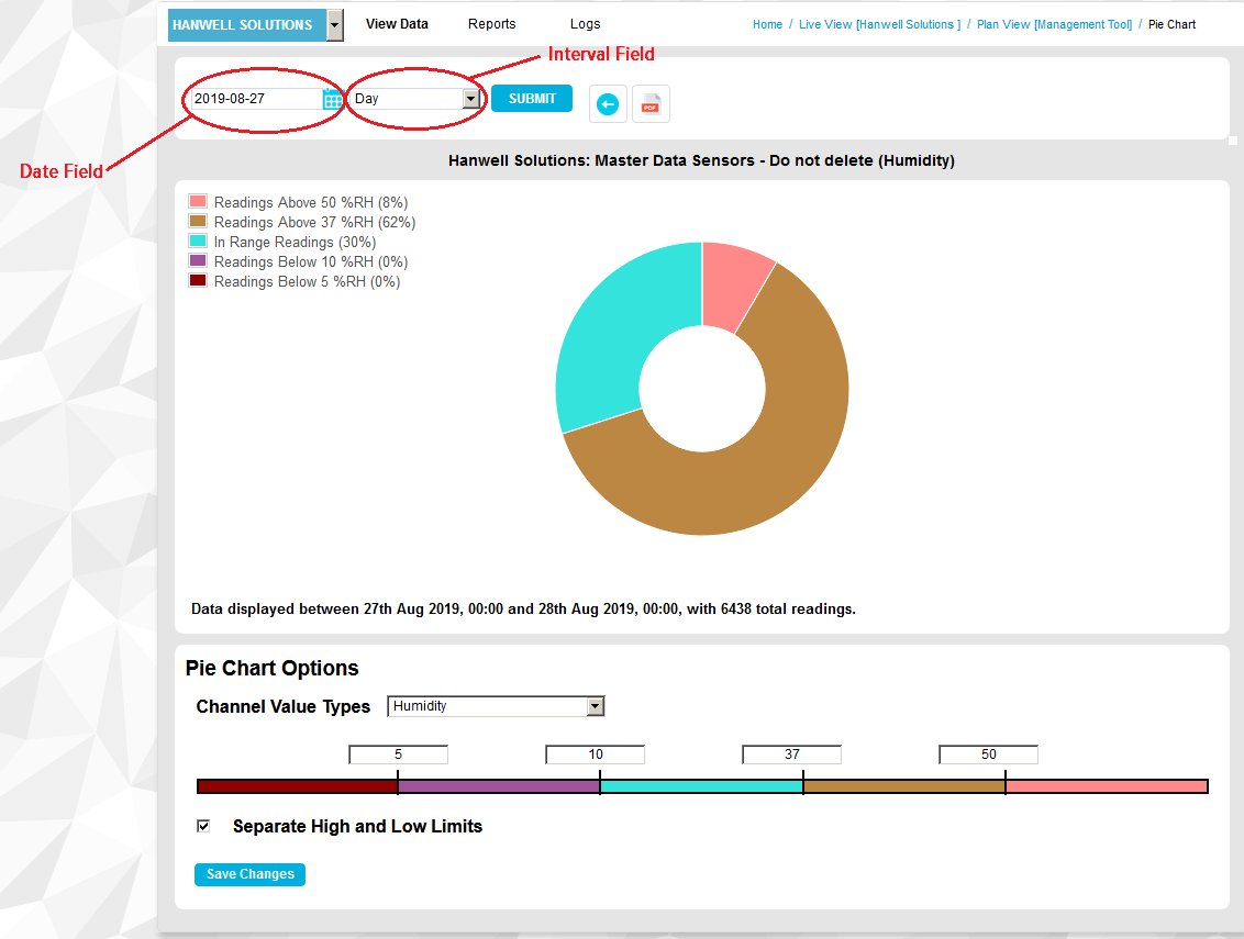
Date and Interval
See Figure 1089 above.
•Date Field
Defines the start date for the Sensor readings represented on the Pie Chart.
➢Either:
Enter a date into the field in the format: YYYY-MM-DD
➢Or:
Select the required date from the calendar displayed by clicking on the Calendar icon.
•Interval Field
Defines the length of time over which Sensor readings will be represented on the Pie Chart, starting from the date specified in the Date: field.
➢Select the required interval: Day, Week, Month, 3 Months, 6 Months or Year from the drop-down list.
After making changes to these two fields, click on the Submit button to display the Pie Chart with the new start date/time interval applied.
Pie Chart Options
Figure 1090
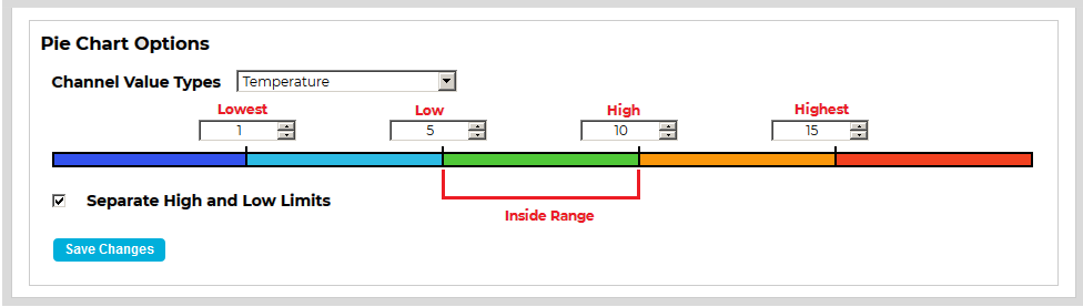
•Channel Value Types
From the Channel Value Types drop-down list, select the parameter (for example: Temperature, Humidity, Digital or CO2), monitored by the Zone's Sensors, that you want the Pie Chart to represent.
•Sensor Value Ranges
Enter values defining the Sensor Value Ranges the Pie Chart is to represent into the entry fields above the colouredcoloredbar. See Figure 1090 above.
➢Highest
Enter a value defining the absolute upper limit to conditions in the selected Zone into the entry field.
➢High
Enter a value defining an upper limit to 'normal'/'acceptable' conditions in the selected Zone into the entry field.
➢Low
Enter a value defining a lower limit to 'normal'/'acceptable' conditions in the selected Zone into the entry field.
➢Lowest
Enter a value defining the absolute lower limit to conditions in the selected Zone into the entry field.
➢Inside Rage
Acceptable values, the Inside Range, are defined as those between the High and Low values and are represented by the central colouredcoloredsection.
| Note: | The red annotations on the above Figure are not shown in EMS. |
•Assigning a Different Colourcolorto a Pie Chart Segment
Each segment of a Pie Chart can only have one colourcolorassigned to it; to change the colourcolorassigned to a segment:
1.Click on the Sensor Value Range of the colouredcoloredbar (see Figure 1090 above) you wish to alter the colourcolorof.
➢The colourcolorPalette Window for that segment is displayed. See Figure 1091 below:
Figure 1091
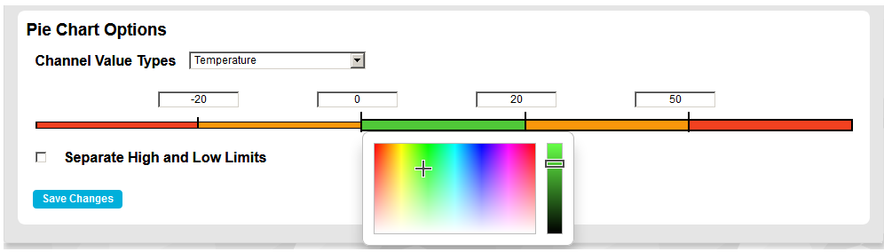
2.Click on the required colourcolorfrom the palette on the left of the Palette Window and/or adjust the selected colourcolorusing the slider bar on the right.
3.Click on the Save Changes button to apply the selected colour.color
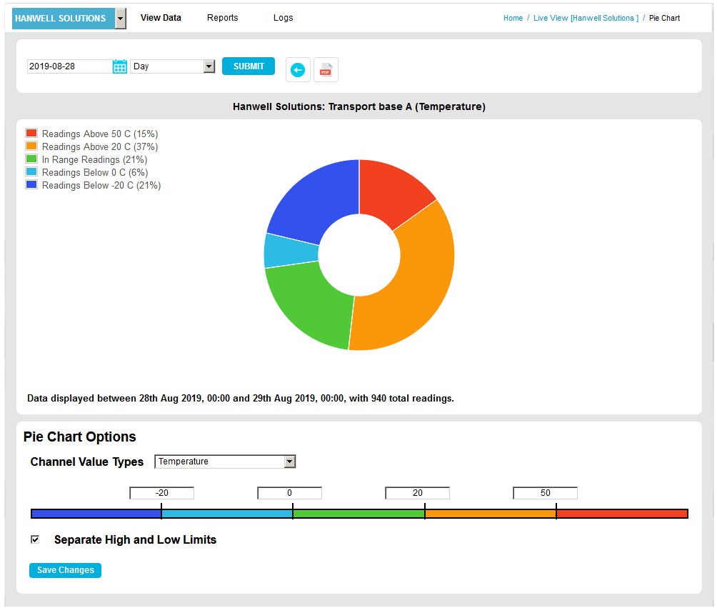
•Separate High and Low Limits
When the Separate High and Low Limits box is ticked, the Pie Chart will be displayed with:
➢One segment representing values above the Highest value.
➢One segment representing values below the Lowest value.
➢One segment representing values above the High value (but below the Highest value).
➢One segment representing values below the Low value (but above the Lowest value).
When this box is ticked, the Pie Chart window could, typically, be displayed as shown in Figure 1092 below:
Figure 1092
When the Separate High and Low Limits box is not ticked, the Pie Chart will be displayed with:One segment representing values outside of the Highest and Lowest values.
➢One segment representing values outside of the High and Low values (but inside the Highest an Lowest values).
When this box is unticked, the Pie Chart window could, typically, be displayed as shown in Figure 1093 below:
Figure 1093
| Note: | When the Separate High and Low Limits box is unticked, you can only select a new colourcolorfor the segments representing values outside the High/Low and Highest/Lowest limits from the right-hand side of the colouredcoloredbar. |
•After making any changes or additions to the Pie Chart Options, click on the Save Changes button to action the changes.