Navigation:
EMS Outputs > Viewing Sensor Data > Graphical Data >> Display Mode - Line Graphs
Display Mode - Line Graphs

Contents
When displaying data, with a specified Interval greater than a Day on a Line or Bar Graph, in either the Chart View for Line charts or the Chart View for Bar charts window, EMS compresses the data displayed on the graphs to reduce loading times, limit network bandwidth usage and maintain graph clarity.
To achieve this compression, individual data points are gathered into 'slots' composed of specific time periods defined for each Interval. Data in these slots is then displayed on the graph as either a single point (Average of all data points gathered over the time span of the slot) or two points (Maximum and Minimum values of all of the data points over the time period of the slot).
The following time periods are defined for each Interval's slot:
•Week Interval graphs: 10-minute periods.
•Month Interval graphs: 30-minute periods.
•3 Months Interval graphs: 4 hour periods.
•6 Months Interval graphs: 8 hour periods.
•Year Interval graphs: 1 day periods.
| Note: | When Day is selected as the graph Interval, data points are displayed as uncompressed raw data i.e. all data points gathered are displayed on the graph. |
When Week or Month time intervals are selected, clicking on the Display Mode icon enables the selection of one of two modes for displaying the compressed data. See Figure 1184 below:
Figure 1184
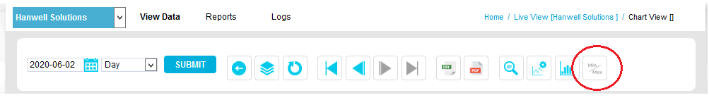
•The Display Mode button will displayed as -
Either:

Or:

Depending on the current Display Mode setting.
The two display modes are:
•Min & Max
Each slot contains the Minimum and Maximum data values for the slot's time period.
Min & Max mode plots can look less smooth than Averages mode plots, but show the full range of all value excursions.
Or:
•Averages
Each slot contains the average data value for the slot period.
Averages mode plots can look smoother than Min & Max mode plots, but can also give a misleading impression of data values.
•By default compressed graphs are drawn in Min & Max mode. To change the mode, see To Change the Display Mode .
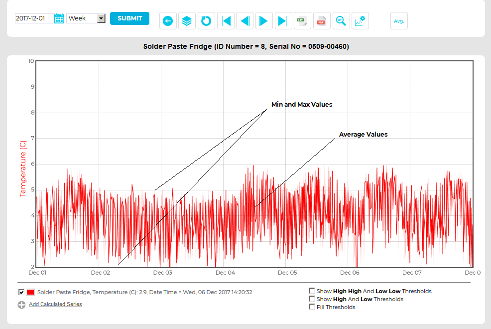
| Note: | If Min & Max mode is selected, Min & Max values for the graph's data will be displayed as shading on the Min & Max graph over an Averages plot line. This shading will become more prominent if the graph's Interval is increased for a given Start date. See Figures 1185 and 1186 below: |
Figure 1185
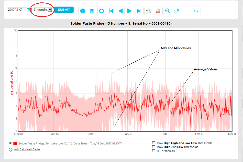
Figure 1186
To Change the Display Mode:
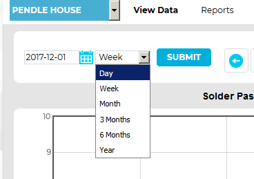
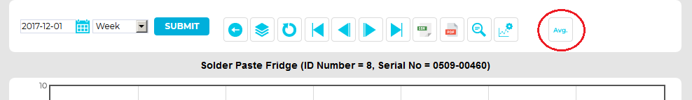
1.Check that Week or Month is selected from the Interval drop-down menu in the either the Chart View for Line charts or the Chart View window for Bar charts. See Figure 1187 below:
Figure 1187
2.Click on the Display Mode button. See Figure 1188 below:
Figure 1188
3.The Display Mode button will displayed as -
Either:
Or:
Depending on the current Display Mode setting.
4.Click on the button to change the display between Averages and Min & Max Display Modes.
•The graph will re-draw using the selected Display Mode.